
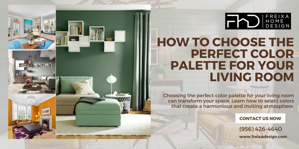
Choosing the right color palette for your living room interior design is crucial because colors significantly impact the mood and feel of your space. Cool colors like blue and green can make your room feel calm and relaxing, while warm colors like red and yellow can add energy and warmth. To pick the perfect colors, start by understanding some basics of color theory, such as which colors work well together. Then, think about your personal style and the characteristics of your room, like its size and the amount of natural light it gets. Choose a base color you love and add accent colors that complement it. By following these steps, you can create a harmonious and inviting living room interior design that reflects your unique style.
Understanding color palette for your living room
Basics of color palette
Color theory is like the science of colors. It helps us understand how different colors work together. Think of it as a guide to choosing colors that look good together.
Primary, Secondary, and Tertiary Colors
- Primary Colors: These are the main colors—red, blue, and yellow. You can’t mix other colors to get these.
- Secondary Colors: These are made by mixing two primary colors. For example, red and blue make purple, blue and yellow make green, and red and yellow make orange.
- Tertiary Colors: These are made by mixing a primary color with a secondary color. For example, mixing blue (primary) with green (secondary) gives you blue-green.
Color Wheel and Relationships
A color wheel is a circle with different colored sections. It shows how colors relate to each other. Colors next to each other on the wheel are called analogous colors and they usually look good together. Colors opposite each other are called complementary colors and they create a strong contrast.
Identifying Your Style
Modern and Minimalist
Modern and minimalist styles use clean lines and simple colors like white, gray, and black. This style focuses on simplicity and functionality.
Traditional and Classic
Traditional and classic styles often use rich, deep colors like burgundy, gold, and dark green. This style feels timeless and elegant, often with detailed and ornate decor.
Rustic and Country
Rustic and country styles use earthy tones like browns, greens, and warm reds. This style gives a cozy, natural, and homey feel, often with wooden furniture and natural materials.
Bohemian and Eclectic
Bohemian and eclectic styles are vibrant and full of life. They use bold, vibrant colors and lots of patterns. This style is free-spirited and mixes different cultural influences.
Industrial and Urban
Industrial and urban styles use cool tones like grays, blues, and metallics. This style often features raw materials like exposed brick, metal, and wood, giving a modern, edgy feel.
Assessing the Room’s Characteristics
Size and Shape of the Room
- Small Rooms: Lighter colors can make small rooms feel bigger and brighter.
- Large Rooms: Darker colors can make large rooms feel cozier and more intimate.
Natural and Artificial Lighting
- Natural Light: The amount of natural light your room gets can change how colors look. A color might look bright in the morning and different in the evening.
- Artificial Light: Different light bulbs (like warm or cool bulbs) can also change how colors appear. It’s good to test your colors in different lighting conditions.
Existing Furniture and Decor
Look at the colors of your current furniture, rugs, and decorations. Your color palette should complement these items. For example, if you have a blue sofa, you might want to choose colors that go well with blue.
By understanding color theory, identifying your style, and assessing your room’s characteristics, you can create a beautiful and harmonious living room that reflects your personality and meets your needs.
Creating Color Schemes
Choosing a base color for your living room sets the foundation for your entire design. It’s like picking the main ingredient for a recipe—it influences everything else you add to the space. Here’s how to choose the right base color in simple terms:
- Importance of a Base Color: Think of the base color as the main character in your living room story. It’s the color that will dominate the walls or large furniture pieces, like your sofa. This color will set the mood and style for the whole room.
- How to Select the Right Base Color: Start by considering your personal taste and the mood you want to create. If you prefer a calm and serene atmosphere, you might lean towards soft neutrals like beige, light gray, or creamy white. For a more dramatic feel, deep colors like navy blue or charcoal gray can add sophistication and depth.
- Examples of Popular Base Colors:
- Neutral Tones: These are versatile and timeless. They include shades like beige, ivory, taupe, and gray. Neutral colors create a clean backdrop and can easily be paired with different accent colors.
- Soft Pastels: Colors like light blue, pale pink, or mint green. These hues can add a subtle hint of color without overpowering the room.
- Bold Colors: If you love bold statements, consider rich tones like deep blue, emerald green, or even a daring black. These colors can make a strong impact but should be used carefully to avoid overwhelming the space.
Choosing your base color is a personal decision that should reflect your style and how you want to feel in your living room. Once you have your base color selected, you can build your entire color palette around it, adding accent colors and textures to complete the look.
Adding Accent Colors for Interior
Adding accent colors to your living room can really bring your design to life! Here’s how you can do it:
- Purpose of Accent Colors:
- Accent colors are like the spice in your favorite dish—they add a pop and make everything more interesting.
- They help break up the monotony of your main color scheme and add depth to your room.
- Choosing Complementary Colors:
- Look at your base color and find its complementary color on the color wheel.
- Complementary colors are opposite each other on the wheel (like blue and orange), and they really make each other stand out.
- Using Accent Colors Effectively:
- Introduce accent colors through things like throw pillows, blankets, curtains, or even a statement piece of furniture.
- Aim for balance—too many accent colors can overwhelm, so start with a few and see how they enhance your space.
- Balancing Warm and Cool Tones:
- If your base color is warm (like red or yellow), consider cool accent colors (like blue or green) to create contrast.
- If your base color is cool (like blue or gray), warm accent colors (like red or orange) can add vibrancy.
- Experimenting with Intensity:
- Accent colors can be bold and bright or soft and muted—it depends on the mood you want to create.
- Don’t be afraid to mix different intensities of colors to add depth and dimension.
- Harmonizing with Patterns and Textures:
- Use accent colors in patterns like stripes, geometric shapes, or floral prints to tie everything together.
- Textures like velvet, linen, or wood can also enhance the impact of your accent colors.
- Seasonal Updates:
- Swap out your accent colors seasonally to keep your living room feeling fresh and updated.
- Think about incorporating seasonal elements like warm oranges and browns in autumn or cool blues and whites in summer.
Adding accent colors is all about personalizing your space and creating a look that reflects your style and personality. Start with small touches and see how they transform your living room!
Creating Color Schemes
Creating color schemes for your living room is like painting a picture where colors harmonize and tell a story. Here’s how to do it in simple steps:
- Monochromatic Color Schemes:
- Stick to shades of one color, like light blue, medium blue, and dark blue.
- Creates a calm and unified look without being too busy.
- Analogous Color Schemes:
- Choose colors that sit next to each other on the color wheel, like blue and green.
- Creates a cohesive and harmonious feel with a bit of contrast.
- Complementary Color Schemes:
- Pick colors that are opposite each other on the color wheel, like blue and orange.
- Adds a dynamic pop of color and creates balance.
- Triadic and Tetradic Color Schemes:
- Triadic uses three colors evenly spaced on the color wheel, like red, yellow, and blue.
- Tetradic uses four colors in two complementary pairs, like blue with orange and yellow with purple.
- Provides a vibrant and balanced look with more color variety.
- Balancing Warm and Cool Colors:
- Warm colors (reds, oranges, yellows) create a cozy atmosphere.
- Cool colors (blues, greens, purples) bring a calming effect.
- Balance these colors based on the mood you want to achieve in your living room.
- Experimenting with Intensity:
- Mix light and dark shades of the same color for depth.
- Use lighter tones for walls and larger surfaces, and darker tones for accents and smaller areas.
Creating a color scheme is about finding colors that work well together and reflect your style and personality. Don’t be afraid to experiment with different combinations until you find the one that feels just right for your living room.
Considering Psychological Effects
Choosing the perfect color palette for your living room:
- Warm vs. Cool Colors:
- Warm Colors: Colors like red, yellow, and orange can make a room feel cozy and inviting. They create a sense of warmth and energy.
- Cool Colors: Colors like blue, green, and purple have a calming effect. They can make a room feel peaceful and relaxing.
- Emotional Impact of Different Colors:
- Red: Often associated with passion and excitement. It can stimulate conversation and create a lively atmosphere.
- Yellow: Bright and cheerful, yellow can evoke feelings of happiness and optimism.
- Blue: Known for its calming effect, blue is often used in bedrooms and living rooms to promote relaxation.
- Green: Symbolizes nature and growth. It can bring a sense of freshness and harmony to a room.
- Purple: Represents luxury and creativity. It can add a touch of sophistication to your living space.
- Neutral Colors: Colors like beige, gray, and taupe are versatile and can create a sense of balance and neutrality in a room.
- Colors that Promote Relaxation vs. Energy:
- Relaxing Colors: Soft blues, greens, and lavenders are soothing and can help reduce stress levels.
- Energizing Colors: Brighter shades like reds, oranges, and yellows can boost energy levels and create a vibrant atmosphere.
- Choosing Based on Room Function:
- Consider how you use your living room. For a space where you entertain guests, warm and inviting colors might be suitable. For a room used for relaxation, cool and calming colors might be more appropriate.
- If your living room doubles as a workspace, choosing colors that promote focus and creativity, like greens and blues, could be beneficial.
- Personal Preferences and Associations:
- Your personal associations with colors play a significant role. If a particular color brings back happy memories or makes you feel calm, incorporating it into your living room can enhance your overall well-being.
- Consider cultural associations as well. Different cultures may have varying interpretations of colors, so it’s essential to choose colors that resonate positively with you and your household.
By understanding these psychological effects of colors, you can choose a color palette for your living room that not only looks beautiful but also enhances the mood and atmosphere of your home.
Balancing Neutrals and Bold Colors
Balancing neutrals and bold colors in your living room design is all about creating harmony and visual interest. Here’s how you can do it in simple terms:
- Start with Neutrals:
- Neutrals are colors like white, beige, gray, or cream. They create a calm and balanced base for your room.
- Use neutrals on larger surfaces like walls and large furniture pieces. They make the room feel spacious and timeless.
- Add Pops of Bold Colors:
- Bold colors are vibrant and eye-catching, like deep blues, rich reds, or bright yellows.
- Introduce bold colors through smaller elements such as accent walls, pillows, rugs, or artwork.
- Maintain a Balance:
- Don’t overwhelm the room with too many bold colors. A few strategically placed bold accents can liven up the space without making it feel chaotic.
- Use the 80/20 rule: 80% neutrals and 20% bold colors. This keeps the room cohesive and balanced.
- Consider Color Intensity:
- Balance the intensity of colors. Pair a strong, bold color with softer neutrals to create contrast and balance.
- For example, a bright red sofa can stand out beautifully against light gray walls and a cream-colored rug.
- Use Patterns and Textures:
- Patterns and textures can help blend neutrals and bold colors together.
- Incorporate patterned pillows or textured throws in bold colors against a neutral backdrop to tie the room together.
- Experiment Gradually:
- If you’re unsure about using bold colors, start small and build up. Try adding one or two bold accents and see how they enhance the room’s look and feel.
- You can always adjust by adding or removing bold elements until you find the right balance that suits your taste.
Balancing neutrals and bold colors is about creating a living room that feels inviting, stylish, and personalized to your preferences. It’s all about finding that sweet spot where both types of colors work together harmoniously to make your space pop.
Using Patterns and Textures
Let’s delve deeper into using patterns and textures in your living room:
- Adding Depth and Interest:
- Patterns like stripes, florals, or geometric shapes can make your living room visually appealing.
- Textures such as velvet, linen, or woven fabrics add a tactile feel to your space.
- Creating Contrast:
- Combine smooth textures with rough ones to create contrast and interest.
- Mix patterns of different scales (small, medium, large) to avoid a flat look.
- Highlighting Focal Points:
- Use textured wallpaper or a patterned rug to draw attention to a specific area, like a fireplace or seating area.
- Incorporate patterned throw pillows or curtains to accentuate your furniture.
- Maintaining Balance:
- Balance bold patterns with more subdued textures or vice versa to avoid overwhelming the room.
- Choose patterns and textures that complement your chosen color palette.
- Enhancing Theme or Style:
- Patterns and textures can reinforce your living room’s theme, whether it’s modern, rustic, or eclectic.
- For a cohesive look, match patterns and textures with the overall style of your furniture and decor.
- Layering Effect:
- Layer different textures such as a plush rug, textured throw blankets, and patterned cushions on your sofa.
- This layering adds depth and coziness to your living room, making it inviting and comfortable.
- Personalizing Your Space:
- Use patterns and textures that reflect your personality and preferences.
- Mix and match patterns and textures that resonate with you to create a space that feels uniquely yours.
By carefully selecting and combining patterns and textures, you can transform your living room into a stylish and inviting space that reflects your personal taste and enhances your overall interior design.
Practical Tips for Painting and Decorating
Preparation Tips for Painting
- Clean the Walls: Make sure your walls are free of dust and dirt. A clean surface helps the paint stick better.
- Fill in Holes and Cracks: Use a filler to fix any holes or cracks in the walls. This will give you a smooth surface to work with.
- Use Painter’s Tape: Apply painter’s tape along the edges of the walls, around windows, and door frames to keep lines clean and straight.
- Protect the Floor and Furniture: Cover your floor and any furniture with drop cloths or plastic sheeting to protect them from paint splatters.
- Gather Your Supplies: Make sure you have all the necessary tools, like brushes, rollers, paint trays, and stir sticks.
Choosing the Right Paint Finish
- Matte Finish: Great for hiding imperfections, but not as easy to clean. Best for low-traffic areas.
- Satin Finish: Has a slight sheen and is easier to clean, making it good for living rooms.
- Gloss Finish: Very shiny and durable, ideal for trim and doors but can highlight wall imperfections.
Painting Techniques
- Start with the Edges: Use a brush to paint the edges of the room first. This is called “cutting in.”
- Roll the Paint: Use a roller for the main areas. Roll in a “W” or “M” shape to avoid streaks and ensure even coverage.
- Apply Multiple Coats: Two coats are usually necessary for a rich, even color. Allow the first coat to dry completely before applying the second.
Accessorizing to Enhance Your Color Palette
- Pillows and Throws: Use colorful pillows and throws to add pops of color to your living room.
- Rugs: A rug can tie your color scheme together and add warmth to the room.
- Artwork: Choose artwork that complements your color palette and adds personality to your space.
- Curtains: Match or coordinate your curtains with your color scheme for a cohesive look.
- Plants: Add greenery for a fresh and natural touch.
Common Mistakes to Avoid
- Overloading on Bold Colors: Too many bold colors can be overwhelming. Stick to one or two as accents.
- Ignoring Lighting Effects: Test paint samples in different lighting conditions to see how they look throughout the day.
- Not Considering the Entire Home: Ensure your living room’s color scheme complements the rest of your home for a cohesive look.
By following these tips, you’ll create a beautifully painted and decorated living room that reflects your style and feels welcoming and comfortable.
Common Mistakes to Avoid
Choosing the right colors for your living room can be tricky. Here are some common mistakes to avoid:
- Using Too Many Bold Colors
- Too many bold colors can make the room feel chaotic and overwhelming. Stick to one or two bold colors and balance them with neutral tones.
- Ignoring Lighting Effects
- Colors can look different in various lighting conditions. Always test your paint samples in different lighting (natural, artificial, and evening light) before making a final decision.
- Not Considering the Entire Home
- Your living room should complement the overall style and color scheme of your home. Think about how your living room colors will flow with adjacent rooms.
- Neglecting Room Size and Shape
- Dark colors can make a small room feel even smaller, while light colors can open up a space. Be mindful of how colors affect the perception of room size.
- Overlooking Existing Furniture and Decor
- Your color palette should complement your current furniture and decor. Don’t forget to take these into account when choosing colors.
- Skipping the Testing Phase
- It’s crucial to test paint samples on your walls. Colors can look very different on a large wall than they do on a small paint chip.
- Ignoring the Psychological Effects of Colors
- Colors have psychological impacts. For instance, blue can be calming, while red can be energizing. Choose colors that match the mood you want to create in your living room.
- Overloading on Patterns and Textures
- Too many patterns and textures can make a room feel busy and cluttered. Balance them with solid colors to create a harmonious look.
- Not Thinking About Future Changes
- Trends come and go, but your living room color palette should be something you’re happy with long-term. Consider timeless colors that you won’t tire of quickly.
- Forgetting to Coordinate with Adjacent Rooms
- Use transition colors or similar shades to create a cohesive flow between rooms, ensuring that the overall design of your home feels connected and harmonious.
By avoiding these common mistakes, you can create a living room that is both beautiful and functional, reflecting your personal style while maintaining a cohesive look throughout your home.
Conclusion
Choosing the right color palette for your living room is a crucial part of finding effective Living Room Interior Solutions. By understanding color theory basics, you can see how different hues work together to create a harmonious space. Consider the size and shape of your room, lighting, and existing furniture when selecting colors. Start with a base color you love, then add accent colors for depth and interest. Always test your colors in various lighting before committing. Balance bold colors with neutrals for a cohesive look. Whether you go the DIY route or hire a professional, the goal is to create an inviting living room that reflects your personality. Remember, small changes like switching out pillows or decor can refresh your palette seasonally or with trends, providing flexible and dynamic Living Room Interior Solutions.